Friday 13 June 2014

Media Past Paper Homework

1.
Q. Explain two ways the extract fits the genre of lifestyle magazines.

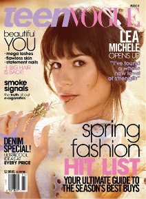
A. On the front cover of the magazine their is direct address. direct address is when the model on the front of the cover is directly starring at you or the speech from the magazine is talking to you. An example would be "have you tried the new diet plan". It makes the reader feel more involved into the story and is if they are part of it too. Their is a mixture of content on the front of the cover such as sexy hair, elegant dresses for summer and food. These contents make the magazine more interesting because their is a larger variety of options to read about and thats what people want, when they can read
something they want to read about.

2.
Q. Explain how each of the following is used in the extract to create effect on the reader:

A. Layout
B. Typography
C. Colour
D. Language

A. The layout in the magazine cover is used well having the coverlines spread out and the model using all the spacing and the most important coverline over the top of the model to show that the coverline is the one they want you to read first.
 B.  The writing on the magazines coverline has a different font to the masthead. The coverlines are also different to each other because some have different colours to the other and although most of the fonts are the same, some have thin writing and some have bold writing.
C. The colour on this magazine stands out because the background is a light grayish colour and the font used is black and the masthead is pink, a completely diffrent colour.
D. The language used on the magazine is informal because it is being written to many people that don't speak formal. An example would be "Summers Here"! This informal because of the exlamation mark and the way its saying summers here in such a quick way. Formal language would be longer and maybe say "Summer is in its time".

3.
Q. Discuss how people and lifestyles are represented in the extract refer to stereotypes in your answer.

A.Lifestyle magazine try to either inspire people to be like someone or they want people to be the best they can be in looks, food, clothes and friends. The magazine that we are focussing on at the moment is a middle aged womens magazine called easy living. The title tells that the magazine is how to live in a easier way then the one they are living now. People are refereed to the magazine by food, clothes, health and looking good. The magazine directs women on how to be the best looking woman that they can be. It tells them what dresses are in and what ones to wear. It tells women what they should eat so that they can fit into the cloths. The magazine is basically a guide to women on directing them on how to be better then they already are. A stereotype for the magazine is how women are not as smart when they dont read the magazine. How they have to read the magazine to understand everything else more.

Thursday 12 June 2014

Media - Half Term Homework

Half Term Homework

1.Conventions are parts of a item to do with media that are unique, parts that are all different and are used in different ways. I have learnt that their are many types of conventions on a magazine such as a masthead. A masthead is the title at the top of the magazine, this is usually the most eye catching piece on a magazine because it is usually big and bold with different colours to the background to stand out so that people can see the magazine from a fair distance. Another convention of a magazine would be direct address. This can be meant by the model on the front cover looking directly at you or by the speech used to talk to you e.g. (how would YOU like to change you life around).Gender representation is used alot in many diffrent magazines. It is used in them to attract buyers. Mens magazines will most likely have a picture of a women presented in a sexual way as exposing their natural bodies. Womens magazines may be the same with a man topless or with a celebrity idol like Oprah Winfrey.(200)

2.The gender


3.On my album cover i haven't used a gender representation. My album cover has me in a hoodie with the colours black and yellow. My album cover can be represented for females and males because you cannot see my face and their is no imagery of a female or male.(50)

4.My skills have massively improved during my Media GCSE classes. I have learnt how to use Photoshop more effectively and can now a album cover as well as a magazine cover. I have learnt the tools that are used in Photoshop and am able to use them well. Two of the tools that i have learnt to make an image look better, or progressed on my ability to use at a higher level are,the blur tool and the smudge tool. I have also learnt how to upload a power point onto blogger using slide share.I have a clearer understanding of what conventions of a magazine are where as before i didn't know what a convention was. (128)

Friday 28 March 2014

My GCSE Booty Project


Tuesday 18 March 2014

Album Covers and CD's #1

This is a album cover and CD put into detail for my Media class. Hope you agree with my review. :D


Monday 17 March 2014

Describing the front cover of FHM


The colours used in the magazines front cover each have a meaning. The red means passion, love and anger, the how to be cool  coverline could be used as in a passion for being cool, same as the heading FHM as in a passion for reading the magazine and how inspiring it can be and Michelle Keegan is the sexiest woman in soap would most probably represent love because of her looks and beauty. 

The gender for this magazine looks as if it is a male because there is a women naked in the bath. This is most likely going to be a males magazine because men are attracted to really hot women, so by putting a women in a bath NAKED will defiantly attract a lot of straight men. This can be bought by a female non the less because some women could want to read about what the model is saying because they want to know how they get famous or just want to know about theirs lifes.

Thursday 13 February 2014

My Magazine Cover


This is my final design of my magazine, iv'e tried to make it eye catchy by adding extra colours on each side and to make the magazine look even better i made the title both colours to give it that better look instead of it being doll.The colours purple and orange have been used because if you look at the colour wheel in my previous blog it shows that these two colours are probably the best to use. Ive added a barcode, price and date to make it look that much more real. The model is a actor/singer/model called Ariana Grande and it took a bit of work to photoshop her and make it look normal gain without the background. I've used multiple fonts to make it more interesting and not to make it plan, with out noticing you would think that the same font is boring.I tried changing the layout of the writing to the words hovering hip length to make it look better and added a different font to add more than just two colours. Over all i am very happy with how my magazine has come out.

Sunday 9 February 2014

Magazine Colour Detailed


This magazine uses the color pink for the background which sets a really calm environment when reading the magazine. The cover lines are black which really stands out against the pink because pink is a lighter color where black is a darker color making it stand out more. By having the words SEX LIFE written in bright pink makes you want to look at that first because it the only color on its own on the front cover. The white cover lines don't stand out to much because the pink is near the same sort of shade of lightness so maybe the editor didn't want these topics to stand out over all the other cover lines on the front cover. On the front cover the title and words written miss JORGIE PORTER are shiny silver which could of had that style of color/text because the editor wanted the magazine to catch peoples eyes( quite literally) by having the sun reflect of from a window maybe and shine in there eyes making them maybe want to see what it is. 
GQ has only three colors for there magazine luminous pink, white and black. The white has been used for big titles and the main cover lines. the black has been used for subheadings and for the date and price where its a white background to keep it standing out since there both opposite colors. The white has been used for ares that have black around for the same use of having the black (to stand out against opposite colors in stead of having a white background and a white font because then your not going to see anything).
The colors yellow and white really do make this magazine look a bit more like interesting because yellow is a unusual color to use while typing and the white just fits in with it, maybe because their both light shades. The black looks like the least important part of the magazine, no because theirs a few cover lines that are black but because if you read them you can tell that its not news its just little pieces of fashion. The white font  to me looks as if its the most important because theirs KATE'S SECRET STYLIST REVELED written in bold and seems like big news for everyone, theirs also a look at Kate Moss's party that's meant to be wild and talk of fashion near the top right. The yellow looks like its been used for just big titles and prices. 

Saturday 8 February 2014

Photoshop Work 2 (Blur Tool)


The blur tool is a very useful tool for making images look realistic again after having them cropped really badly using magic wand or the magnetic tool. I have used the blur tool for my magazine cover where my models legs were really badly damaged after using the magnetic line but i covered it up using the blur tool by swiping across the leg to the part where there is no leg and repeat after a while and your leg will look normal. You can also un-sharpen the sides of the model after cropping by swiping the blur tool around him/her to make it look a little bit more realistic, and not make it stand out to a bad form.

(I would use an example but i have already fixed the legs and do not have a problem with my model).

Colour Conotations

Different colours can convey different meanings or connotations to the viewer.

Sports: For a sports i would use a red because the explication for the colour red seems like it would suit this type of section. The parts in the colour red such as physical, energy and stamina are all used in sports and thats why i would use red for sports because it would suit the magazine the most and its readers.

Gaming: The colour yellow stimulates humor, fun and creativity. I agree with this being the colour for yellow because all of these can be created  while gaming. Minecraft would be an example of creativity because in this game you create what you want with your imagination.

Ponies: The colour green would be best for ponies because ponies  are nature, love and harmony. When a girl\women thinks of ponies they would most likely think of a pony on its own that's riding in a green field and bright sun.

Bakery: The colour for bakery is defiantly violet because its creates imagination and artistic ideas. Will baking ideas can flow for what you want your food to look like. It has artistic views because you decide what you want it to be like.

Monday 20 January 2014

Magazine Titles

My magazine titles

  • Girls 4 Ever
  • Fashion Guide
  • Gossip Line
  • Shine
  • Reflect
  • Cosmic
  • Star
  • Trust
  • Teen Star UK
  • Heart Star
One of these titles will most likely be used in my magazine cover that i am making. The titles are not put into favorite order but Teen Star UK is my favorite so far.

The covers on the right are famous teen magazines so i am looking at them to get inspiration for my magazine cover.

Magazine Cover Lines

Magazine Cover lines

  • get sex tips.
  • 10 ways to get the current look.
  • inside Ariana Grande's wardrobe
  • weight loss method.
  • how you can get a boys attention.
  • unbelievable fashion bargains. 
  • celebrity gossip.
  • interviews.
  • what celebrities are wearing.
  • your favourite movie heart throbs 


The cover lines above are all going to be on my magazine cover if i can get them all on. The inside Ariana Grande's wardrobe is meant to be a special look at what she wears as she has an interview for my magazine. 


The magazines on the right have different styled fonts and colours for there magazines, this is how i want my magazine cover to look like.


Thursday 16 January 2014

Typography

This font is modern because it looks futuristic and has sharp edges giving it a modern sleek look.

This font looks like a child's writing because its sloppy just like young children.  

This font looks like a sports font because its sharp and smooth (extreme) making you think gym or sports.


This font looks masculine because it looks formal as if someone was trying to get a job and wrote nice.

This font looks Feminine because its neat and looks very smart which is saying that women write neater then men.

This writing font looks sophisticated because it is nice and curvy making it look as if the writer has trained in writing nicely.

    This is clear that this id bold because the writing is thick and large.


 This is clearly historic writing because of the over the top curves and      sharp ends to letters.    

Symmetrical Work


These front covers are symmetrical because the right and left hand side of the magazine are the same 
(at least the main image is). These magazine covers look as if  you could get the right or left side of their face and put a mirror there and it would look exactly the same.


these front covers are all asymmetrical  because they are not the same on the right and left side of the magazine. there is no match to each side of the magazine.